The Miracle Modus
Sometimes you just like to pick stuff up and watch the colors. It's so beautiful. Life is beautiful.
-- Gamzee Makara
The Miracle Modus is a thing which emits soothing patterns of light and sound. It's implemented as an app on iOS and Android, although distribution isn't entirely settled. While the Modus is intended to be restful for most people, particular attention has been given to the way in which many autistic people respond to the application. (If you're about to write me a letter telling me I should have used "person-first language", please read this first.) Autistic people often experience sensory overload, and strong, simple, and patterned stimuli seem to help. For me, brightly-colored rainbow objects behaving in mathematically-sound ways are very helpful. More information about this app, and autism.
Since some users have reported distress with modes where the pattern was not clear, but liked them once they understood the pattern, there's descriptions of the logic of all the modes.
NEWS
The 1.1 update is on its way into the various app stores, or will be soon; it's in what I hope is final testing. This page now describes the 1.1 update; there's a couple of new modes, and the UI has changed slightly. If you don't have 1.1 yet, double-tap in a corner to access settings, and double-tap anywhere else to advance to a new mode.
Instructions

The basic interface is to display some sort of pattern of brightly-colored things, which may respond in some way to touching, dragging, or gravity. Tapping in a corner brings up two icons, a gear and a fast-forward arrow. To alter settings, tap the gear (or on Android devices, use the Menu button). To move to another mode, tap the arrows. The modus is intended to be sort of a soothing toy to play with. (If you are not sure why things to play with are a good thing, you may want to learn more about playing.)
The Miracle Modus is currently available for iOS devices, and also for Android devices with the Google Play store. I don't currently have plans for the Nook or Kindle stores.
Settings
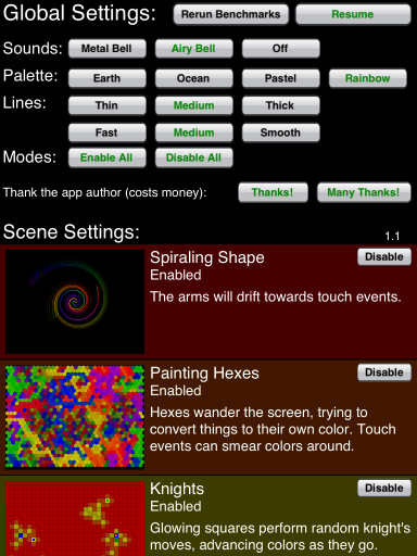
The settings page is a scrolling list showing the various modes, plus some global settings. The settings page allows you to do several things:
- Enable or disable modes. The Enable/Disable button for each mode does exactly what it says.
- Change the sound effects used. There are currently two sets of sounds used; the default sound is called "Airy Bell", the alternative sound is called "Metal Bell". You can also turn the sounds off.
- Change the palette used; the default is called "rainbow", but there are also pastels, earth tones, and an ocean color set.
- Alter the thickness and smoothness of line drawing. "Smooth" will run slower on some devices, but usually look prettier.
- Rerun the benchmarks. The mini-benchmarks run during startup give the Modus some idea of how many lines it can draw fast enough to make a given display mode look smooth. If you find that modes slow down dramatically while you're touching the screen, re-run the benchmarks and drag one or two fingers on the screen while they run, and it should improve.
- Donate money to support the developer. Because a significant number of the target audience members are disabled, the app is provided free, but if you want to donate money, you're encouraged to. The in-app purchase "thanks" does not unlock or enable anything, or otherwise affect the app's behavior; it just encourages me to keep developing the app.
- Check the version number (it's the small number in the lower-right corner of the global settings; 1.1 in the image). If you encounter bugs, please mention the version number in any reports. Bug reports, comments, questions, and such should be directed to modus@seebs.net.
Known Issues
At least one user has reported a crash on a Samsung Exhibit. I don't have one so I can't test this, but it looks like a rendering hardware compatibility issue from the crash dump.
Audio performance may be poor on some devices. The 1.1 update changes the sound files in a way that seems to help on a lot of low-end hardware, and I haven't found any problems from that yet.
Understanding the Modes
While most of the modes have at least some random aspects to their behavior, they are nonetheless all using that information in some kind of patterned way. They are presented here in the order the application displays them in. If you have disabled some modes in settings, those modes are skipped.
When sounds are determined by a color (which they nearly always are) they follow the same rules. The notes cover a three-octave range, and for each octave, the sounds ascend from red to purple. (Purple in one octave is the same note as red in the next octave.) The instruments currently provided are pentatonic minor scales. In modes which have more than six colors, all the shades between red and orange are considered red, all the shades between orange and yellow are considered orange, and so on.
- Spiraling Shape
- Painting Hexes
- Knights
- Bouncing Spline
- Cascade
- Lissajous Figures
- Raindrops
- Spiraling Shape 2
- Wandering Color
- Cascade 2
- Bouncing Lines
- Knights 2
- Fire
- String Art
- Firebugs
Spiraling Shape
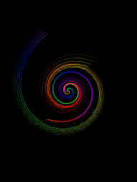
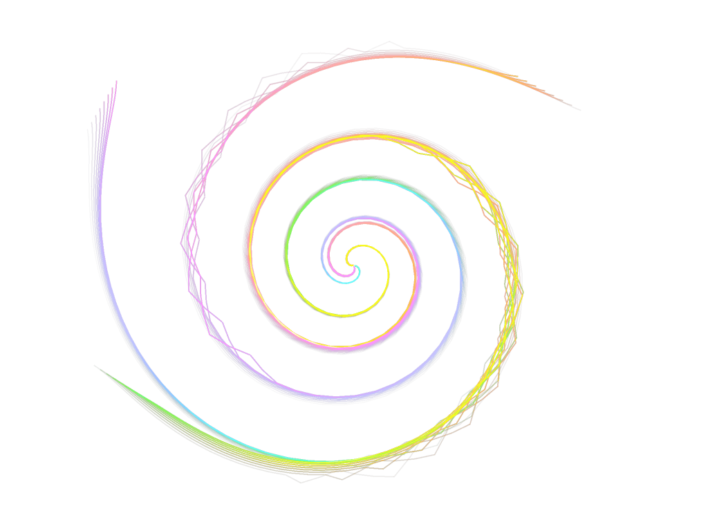
Shapes: The basic pattern is three lines spiralling out from a center point. Each line's outer endpoint moves around the screen, bouncing off the edges. Lines will have some amount of history (more on faster devices) fading out behind them. When lines bounce, ripples are created which flow down to the central point.
Sounds: Whenever an endpoint bounces off the edges of the screen, it plays a note based on the color the endpoint was at the time of the bounce.
Interaction: Lines will tend to gravitate towards touch events, with each line following a different event.
Notes: This one was Luka's idea. It took a lot of tuning to get from "there should be a mode with rainbows spiralling out" to this. Early on, the inner parts of each spiral were very smooth, and the outer parts much blockier; the math that corrects for this is why the edges curve out a little right near the end. In an early version, I did a ton of work trying to make the lines spin, calculating them going out; it became a lot easier when I switched to generating points and calculating inwards. This is probably my favorite mode. And yes, the name is a reference to the They Might Be Giants song.
Painting Hexes
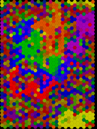
Shapes: There's a grid of hexes of varying colors. There is an active point of each color. These points move around the grid. Each time a point moves, it looks at the three hexes in front of it (they have a facing, which is not displayed), and moves to the one furthest from its own color and full brightness. The hex it moves to is changed to its color and full brightness, and the two squares behind it and on the sides are nudged towards its color and made a little brighter. The whole field slowly fades.
Sounds: There's a background pattern of regular notes. If one of the painting hexes tries to overwrite one of the other hexes, it plays a tone. If you are touching the screen, that will also play tones.
Interaction: If you touch a hex, that hex and the hexes near it are brightened, and the hexes near it are shifted towards its color. If you then drag your finger around, it will continue nudging hexes near your finger towards the color of the hex you first touched. Multiple simultaneous touches work, with each having its own color. Notes are played corresponding to the color of the first hex touched.
Notes: In an early version, the painting hexes went solely by color-difference, ignoring brightness. If you left it for a while, eventually each pair of opposite colors (yellow and purple, red and green, blue and orange) would end up following each other in a small circle. The slight preference for darker squares prevents them from getting stuck.
Knights
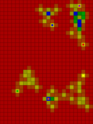
Shapes: There's a square grid, with six active points on it. The points take turns jumping around in random knight's moves. The square it lands on is advanced in color twice (red through orange to yellow, for instance), and the four adjacent squares are advanced once. The whole field slowly fades.
Sounds: Backdrop of tones, plus knights will play a tone based on the color they have changed a square to.
Interaction: Knights will tend to move towards touch events, with each knight preferring a different finger in multitouch.
Notes: This was the first mode which was really interesting. The combination of knight's moves and plus signs was chosen so that a knight will always adjust things near what it last adjusted, but never any of the squares it hit on its last move.
Bouncing Spline
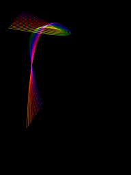
Shapes: A simple four-point spline curve bounces around the screen. Each of the four control points is bouncing separately.
Sounds: When one of the control points bounces off an edge, a noise is played.
Interaction: Touch events attract the control points, with the first two multitouch events attracting the ends of the line.
Notes: While the source for this was translated to Lua, the original logic for the calculations was written sometime in early 1994, when I wrote this display for the Amiga. It was rainbow-colored then, too.
Cascade
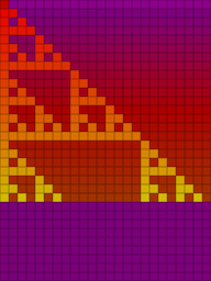
Shapes: Another field of squares. In this one, successive rows are filled out by a cellular automaton. For each square, if exactly one of the square above it and the square to the left of it are highlighted, the new square will be highlighted. Highlighted squares are drawn about one hue ahead of non-highlighted squares, with each row nudging both hues forward a bit. Highlighted squares are set to full brightness, unhighlighted squares are nudged up a bit; the entire field slowly fades. If a row has no highlighted squares, a random square is highlighted.
Sounds: Sounds are played corresponding to the number of distinct regions in each row.
Interaction: Squares which are touched are flagged, and the next time processing reaches them, it will treat them as having an inverted state. Also, the cascade follows device orientation; the next row is "down", rather than moving in the same direction all the time.
Notes: It only takes one or two squares being out of sync to produce some very interesting patterns, but the essential fractal triangles nature persists.
Lissajous Figures
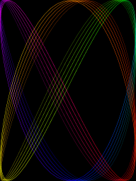
Shapes: Lissajous figures, with delta changing slowly over time, and some history. Starts with a = 2, b = 3.
Sounds: When one of the six points that correspond to particular colors crosses from positive to negative, a sound is played.
Interaction: Touching the screen adjusts a and b, with a ranging from -2 to +2 or so, and b ranging from 1 to 5 or so. There's also a lot of fancy math to nudge the ratios away from degenerate cases which don't look pretty.
Notes: When I first described the Modus to my mom, she pointed out that my dad used to watch lissajous figures on an oscilloscope for hours. I did too, come to think of it.
Raindrops
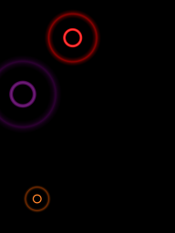
Shapes: Raindrops appear, expand while fading, and disappear. At the start of the mode, they appear in rainbow order; however, they have varying durations, and are re-inserted in the list in the order that they disappear, so they can eventually end up pretty shuffled.
Sounds: Each drop has a preferred color and octave, and plays that sound when it appears.
Interaction: Touch events and drag events create chains of points where future drops will spawn.
Notes: This was originally slightly prettier, but it was unbelievably slow on anything but the iPad 3. The raindrop images are pre-rendered, and are just being scaled and faded.
Spiraling Shape 2
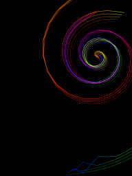
Shapes: This is the same basic design as the other Spiraling Shape pattern. The difference is that the center point is not anchored to the screen, although it tends to move towards the center of the screen.
Sounds: Same as for the original spiraling shape mode.
Interaction: The significant difference is that the first point in a multitouch event attracts the center of the spiral, rather than one of the arms. If there's no touch event for that point, the spiral acts as though you were touching the center of the screen.
Notes: I did this mostly to see what it would look like. I'm not entirely sure whether it's a good idea or not, but it sure is interesting.
Wandering Color
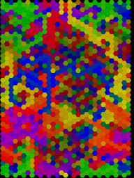
Shapes: A field of hexes, much like the ones in Painting Hexes. the difference is that in this one, the points tend to wander in or near the direction they're currently moving and don't react to their scenery.
Sounds: Same behavior as Painting Hexes.
Interaction: Also the same behavior as Painting Hexes
Notes: This was the first hex display mode, and existed mostly to test out the display code. But I sort of like watching it, even though it doesn't do as much.
Cascade 2
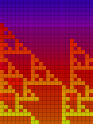
Shapes: This mode is similar to the Cascade mode, differing primarily in the interaction rules.
Sounds: Same behavior as the Cascade mode.
Interaction: This mode ignores device orientation. However, instead of touched squares being marked for processing the next time the display gets to them, they start cascading immediately, causing lines under them to get recalculated.
Notes: It took something like three hours to get from a perfectly clear description of what I thought I wanted to something which actually did it.
Bouncing Lines
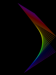
Shapes: A line (or possibly several lines) bounces around the screen, leaving a large amount of history behind it.
Sounds: When the moving points bounce, they play sounds based on the line's current color.
Interaction: Touch events attract points. Multitouch causes additional points to be added, so a three-finger touch will cause a triangle to bounce around the screen. Single touches will cause the additional lines to get dropped.
Notes: This is another mode that I first implemented as a graphics demo on the Amiga in the early 90s.
Knights 2
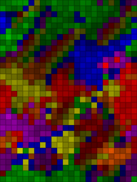
Shapes: This is, as the name suggests, a variant on Knights. In this mode, rather than advancing colors around the rainbow, the knights set the square they land on to their own color, and migrate nearby squares towards their color.
Sounds: Similar to Knights, but the sound played is based on the color the square had before it got changed, rather than after it got changed.
Interaction: Same as Knights.
Notes: The initial display with diagonal rows of colors is based on the way I had a keyboard painted some years ago.
Fire
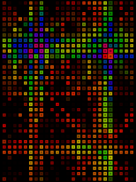
Shapes: A grid of squares, which range from smaller, dimmer, red squares up through larger, brighter, fuschia squares. This roughly represents a level of energy; brighter squares have more energy, which tends to spread over time. Random locations get energized.
Sounds: Lower tones for the random background energy, higher ones corresponding to the colors of squares that the user interacts with.
Interaction: Touch events add energy, with the amount of energy decaying somewhat over the duration of a touch event, but being increased by the energy of squares touched.
Notes: This is probably the most complicated of the modes, and will not work well (or have many squares) on devices with slower CPUs. The benchmarking for it is a little approximate.
String Art
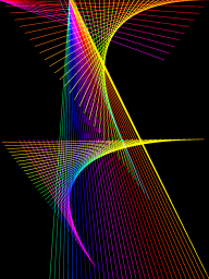
Shapes: Sets of lines bouncing around the display; similar to the Bouncing Lines mode, but there are multiple separate sets, and they are picking points to move towards rather than reflecting off walls normally.
Sounds: Tones reflect the colors lines have when they bounce.
Interaction: Lines slightly prefer to move towards touch events.
Notes: This display is unusual in that it can look much better with un-smoothed lines.
Firebugs
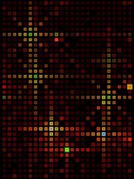
Shapes: Similar to the Fire mode, but there are six points that move around adding energy, similar to the knights in the knights modes.
Sounds: The moving points have their own tones.
Interaction: As with Fire, touches add energy.
Notes: The only real difference from Fire is the more structured energy input.
About the name
The name "Miracle Modus" is used by kind permission of Andrew Hussie; it's a reference to a couple of pages in his webcomic Homestuck. When I first showed this app to my friend Luka, who is a big Homestuck fan, he started referring to the app as "the Miracle Modus", and the name sort of stuck. I got in touch with the Homestuck crew, who graciously permitted me to use the name.
The etymology is that characters in the comic have a thing called a "fetch modus" which is how they hold and retrieve items. It's like the inventory system in some video games, but different characters use different systems, many of them named after and based on common data structures used by programmers. One character uses the "miracle modus", which is introduced by the text "It is captchalogued through your MIRACLE MODUS. You have absolutely no idea how this thing works. And you don't want to know.". The thing that really led to the name, though, was the next page, which says "Sometimes you just like to pick stuff up and watch the colors. It's so beautiful. Life is beautiful.".
Seebs, LLC supports gay marriage
Yes, really. Here is the apparently-unrelated statement on marriage, including an explanation of why I am mentioning this as part of the product literature.
